Quick snapshot
Role: Lead Content Strategist
Team: Digital Experience, Marketing, WebOps, SEO
Duration: May 2023 – Ongoing
Summary
A scalable, embedded content system that brings consistency, accessibility, and strategy to every component across UW Medicine’s digital ecosystem — reducing confusion, design debt, and rework across teams.
Key impact
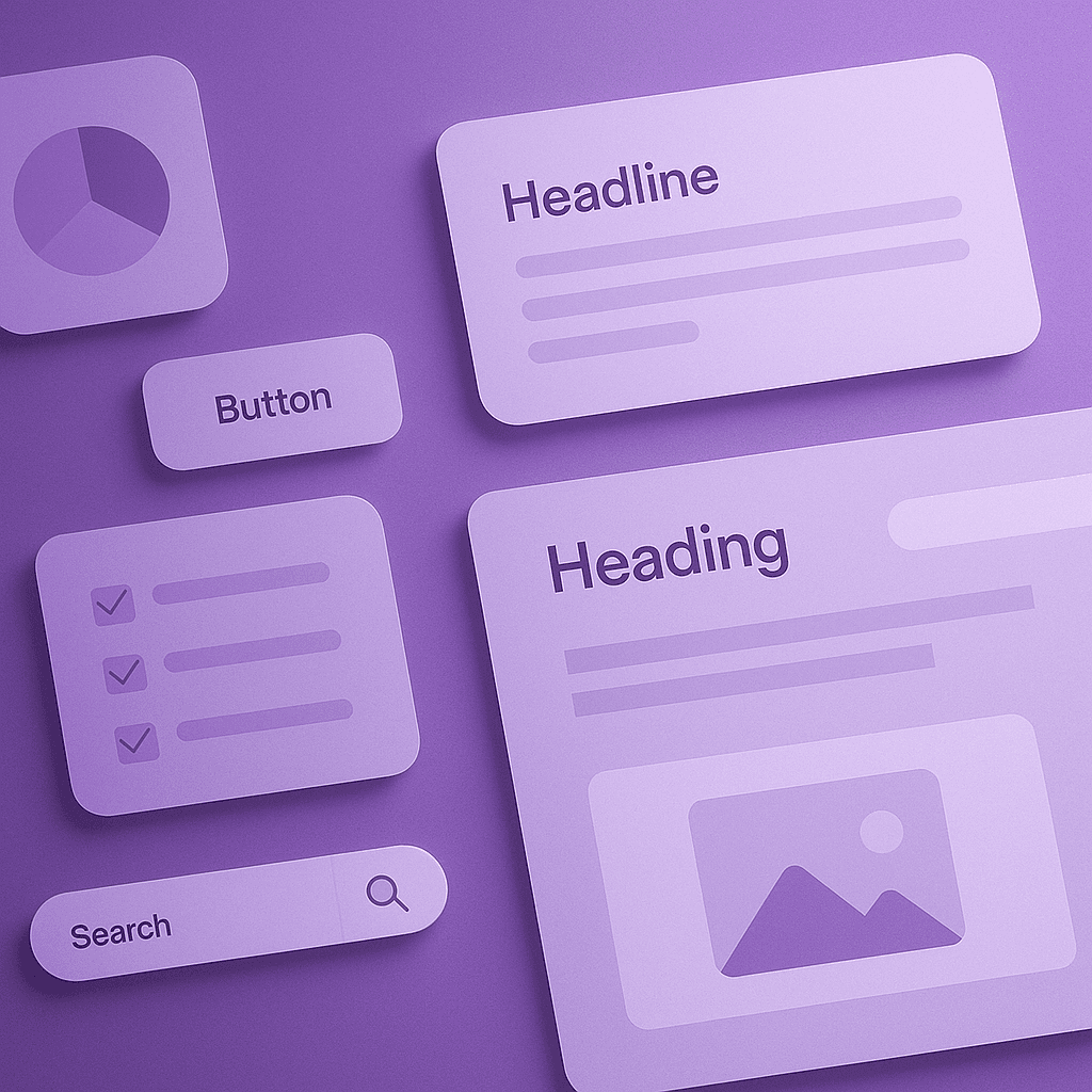
Standardized 45+ components across design and CMS
Resolved 75+ inconsistencies in structure, labels, and tone
Enabled faster builds and reduced content-related dev questions
Formed the foundation for content governance, training, and templates
Overview
As UW Medicine scaled its site and design system, the lack of a content layer created growing risks: inconsistent tone, inaccessible labels, and a high reliance on UX writers for repetitive guidance. I led the creation of a Content Design System — a structured layer of documentation, usage guidance, and accessibility standards integrated directly into Figma and CMS tooling.
This work became the foundation for our content governance model and enabled faster, more confident work across UX, WebOps, and clinic-facing teams.
The Challenge
01
No source of truth for content usage across components
02
Tone, voice, and structure varied by author or implementation
03
UX content team was overloaded with repeat QA and guidance requests
My Role
Audited 50+ live and design system components
Standardized 45+ high-use modules with consistent, accessible guidance
Authored component-level usage rules, tone standards, and real content examples
Integrated accessibility best practices (WCAG 2.1) into naming, labeling, and structure
Embedded guidance into Figma (component descriptions, do/don’t usage blocks)
Partnered with WebOps to align CMS configurations with design logic
Process
1. Audit & Prioritize
Reviewed design system, CMS modules, and live pages to catalog inconsistencies in headings, labels, tone, hierarchy, and accessibility. Prioritized high-traffic or high-friction components first.
2. Standardize Content Patterns
For each component, I defined:
Usage purpose
Recommended tone/voice
Word count or character limits
Label vs. heading guidance
Accessibility considerations (e.g., alt text, semantic structure)
3. Build Measurement Models
Wrote documentation directly inside Figma components and mirrored in Confluence. Shared guidance with UX, WebOps, and SEO teams. Provided examples and editable starter blocks to support reuse.
3. Embed & Distribute
Wrote documentation directly inside Figma components and mirrored in the organization's online internal design system site. Shared guidance with UX, WebOps, and SEO teams. Provided examples and editable starter blocks to support reuse.
4. Extend into Systems
Aligned with CMS team to bake content rules into component configurations (e.g., required fields, max length). Guidance became part of governance, onboarding, and QA workflows.
Results
Outcome
Detail
“Before this, every new page felt like starting over. Now it feels like we’re building on something solid.” — Web Content Writer
Takeaways
01
A content design system is what makes voice, tone, and clarity repeatable at scale
02
Guidance must live where people work — not in PDFs, but inside tools
03